Frontend Development Challenges

Challenges

Week 1 🟩

Build a Basic Email Client (HTML GMAIL)

Pre-requisites

Before you begin, ensure you have the following:

  • Basic Understanding of HTML: Familiarity with HTML tags and structure.

  • Willingness to Learn: A desire to understand how to build web interfaces using HTML.

Problem Description

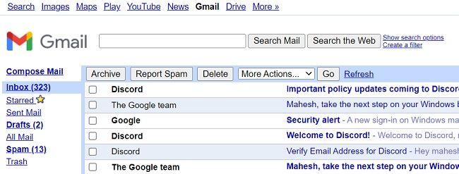
Imagine you're a freelance web developer looking to enhance your portfolio. You want to showcase your ability to structure web pages effectively by creating a simple email client interface. Think of it as a basic, stripped-down version of Gmail. This low-fidelity prototype will demonstrate your skills in HTML and provide a visual example of your capability to potential recruiters and clients. An email client interface is a perfect project because it involves a variety of HTML elements and structures, illustrating your comprehensive understanding of web development fundamentals.

Problem

Your challenge is to build the basic interface of an email client using only HTML. This will include various sections to mimic the layout of Gmail. Follow these steps to create your project:

  1. Structure:

    • Use semantic HTML tags to define the layout.

    • Start with the usual declarations (<!DOCTYPE html>, <html>, <head>, <body>).

    • Create a header section (<header>) containing a logo (use an <img> tag) and a search bar using an <input> element.

    • Employ a <nav> element for the sidebar navigation. Include links for Inbox, Sent, Drafts, etc. (use anchor tags <a>).

    • Divide the main area into two sections:

      • A left-hand pane (<section>) representing the email list. Use another <section> or <ul> within it to display individual emails. Each email item can be a <div> with elements for sender name (<span>), subject (<strong>), and a snippet of the message (<p>). Use a class attribute to visually differentiate unread emails.

      • A right-hand pane (<section>) to display a placeholder for the selected email content. This can be another <div> containing placeholders for sender information, subject line, and the email body (<p>).

  2. Basic Styling (Optional):

    • You can add minimal CSS inline styles within the HTML tags (e.g., style="width: 200px;") to differentiate the layout sections and make it visually appealing (font sizes, borders). However, the focus should be on using semantic tags to achieve the basic structure.

Submission Guidelines

  1. Code Submission:

    • Submit your HTML code for the email client interface.

    • Ensure your code is well-structured and uses semantic HTML tags.

  2. Screenshot:

    • You should include a screenshot of your code running in a web browser for better visualization, but it’s not mandatory.

Example Structure

Here is a basic example to guide you:

Learning Resources

Week 2 🟩

Design & Code Your Portfolio Challenge

Pre-requisites

To successfully complete this challenge, you should have:

  • Basic knowledge of:

    • HTML: Structure and content of web pages.

    • CSS: Styling and layout of web pages.

  • Optional:

    • Familiarity with Figma or another design tool for creating wireframes and mockups.

    • Basic understanding of JavaScript for adding interactivity (optional).

  • Tools:

    • Figma (or another design tool) for UX design (optional).

    • Code editor (e.g., VS Code, Sublime Text) for HTML and CSS coding.

    • Web browser for testing your website.

    • GitHub Pages or Netlify for deploying your website (optional).

Problem Description

Imagine you're a budding front-end developer or UX designer, eager to land your first job in tech. Recruiters often look for tangible proof of skills, and a personal portfolio website is the perfect way to showcase your work. By creating a portfolio website, you not only display your design and coding abilities but also demonstrate your commitment to professionalism and personal branding.

For instance, a recruiter from a top tech company is reviewing applications for a junior front-end developer position. They come across your application and see a link to your portfolio website. Intrigued, they click on it and are immediately impressed by the clean, user-friendly design and the attention to detail in both the layout and the code. This makes your application stand out and increases your chances of getting an interview.


The Goal:

Create a visually appealing and user-friendly portfolio website that highlights your profile picture, basic resume information, and optionally, links to your design projects.

The Tools:

  1. Figma (Optional): For those interested in UX design, use Figma to first design your website layout and user flow. Utilize features like frames, grids, and text styles to create a cohesive and responsive design.

  2. HTML & CSS: Once you have your design (or a clear idea in mind), code your website using HTML and CSS to build the structure and add visual styling.

The Challenge Breakdown:

Design Phase (UX Focus):

  1. (Optional) In Figma:

    • Create a wireframe of your website layout. Include sections for your profile picture, resume details (education, skills, experience), and project links.

    • Design the visual style of your website, including typography, color scheme, and any visual elements like icons or illustrations.

    • Ensure your design is responsive and adapts well to different screen sizes.

Development Phase (Front-End Focus):

  1. Code your website using HTML:

    • Define the basic structure and content sections.

  2. Style your website using CSS:

    • Implement the design elements you created in Figma (or envisioned).

    • Focus on achieving a clean and well-organized code structure.

Bonus Challenge:

  1. Implement basic interactivity features using JavaScript (optional).

  2. Deploy your website to a free hosting platform like GitHub Pages or Netlify.

Tips:

  • Keep it simple and focus on strong typography and clean layout.

  • Use clear navigation to ensure visitors can easily find the information they need.

  • Test your website on different devices (desktop, mobile) to ensure responsiveness.

  • Search online for inspiration and tutorials on portfolio design and development.


Submission Guidelines

  1. Code:

    • Organize your code into well-commented, readable files.

    • Include clear section headers for HTML structure and CSS styling.

    • Ensure all code runs without errors and produces the expected results.

  1. Documentation:

  • Create a README file that explains the steps you took, any assumptions you made, and any challenges you encountered.

  • Include instructions on how to run your website locally.

  1. Submission:

  • Submit the ZIP file through Slack or simply upload to GitHub/Figma and share link to Repo.

Learning Resources

Week 3 🟩

Building a Responsive Portfolio Website with Bootstrap

This challenge introduces you to the power of Bootstrap for building responsive and user-friendly portfolio websites.

Prerequisite

Before starting this challenge, ensure you have a foundational understanding of the following:

  • Basic HTML, CSS, and JavaScript.

  • Familiarity with Bootstrap framework.

  • Basic knowledge of web development principles and responsive design.

Problem Description

Imagine you are a web developer looking to create an impressive online portfolio to showcase your skills and projects to potential employers and clients. A well-designed portfolio not only highlights your technical abilities but also demonstrates your eye for design and user experience. By building this portfolio using Bootstrap, you can quickly create a responsive and visually appealing website that stands out. Successfully completing this task will make you an attractive candidate for front-end development roles, as it shows your ability to use modern frameworks to build professional websites.

Instructions

Objective: Create a personal portfolio website showcasing your skills and experience using Bootstrap's components and utilities.

Steps:

  1. Project Setup:

    • Set up your development environment with HTML, CSS, and JavaScript files.

    • Include Bootstrap's CDN links for CSS and JavaScript libraries.

  2. Basic Structure:

    • Build the website's basic structure using HTML:

      • Create sections for your header, navigation bar, hero section, about me, skills, projects, contact, and footer.

      • Utilize semantic HTML elements like header, nav, section, and article for clear organization.

  3. Styling with Bootstrap:

    • Use Bootstrap's pre-defined classes for components like buttons, cards, and forms for easier styling.

    • Customize the website's appearance through Bootstrap's utility classes (e.g., margins, paddings, colors).

  4. Navigation Bar:

    • Implement a navigation bar using Bootstrap's navbar component with proper links to different sections of the website.

    • Make the navigation bar responsive to adjust its behavior on smaller screens.

  5. Hero Section:

    • Create a visually appealing hero section showcasing your name, profession, or a short description about yourself.

    • (Optional) Consider utilizing Bootstrap's jumbotron or image components for effective presentation.

  6. About Me Section:

    • Introduce yourself and your background in detail using text and visuals.

    • Explore Bootstrap's cards and text formatting classes for a clean and informative layout.

  7. Skills Section:

    • Highlight your skills and expertise using progress bars, badges, or icons provided by Bootstrap.

    • Experiment with different visualizations to represent your skill levels.

  8. Projects Section:

    • Showcase your projects using cards with thumbnails, titles, and brief descriptions.

    • Consider including links to project websites or repositories for further exploration.

  9. Contact Section:

    • Provide a contact form for visitors to reach out using Bootstrap's form components.

    • Ensure appropriate form elements (email, message) and a submit button.

  10. Footer:

    • Create a footer section with additional information like copyright notice or social media links.

    • Style the footer using Bootstrap's utility classes and positioning options.

Bonus Challenge:

  • Integrate JavaScript and Bootstrap's JavaScript plugins to add interactivity (e.g., animations, carousels, modals).

  • Customize Bootstrap's default styles using your own CSS to create a unique visual identity for your portfolio.

  • Implement a contact form validation feature to ensure proper user input.

Learning Outcomes:

  • Gain hands-on experience using Bootstrap components and utilities for rapid website development.

  • Understand the principles of responsive design for creating websites that adapt to various screen sizes.

  • Learn how to effectively structure and style a web page with Bootstrap's pre-built classes.

  • Develop a professional-looking portfolio website to showcase your skills and attract potential opportunities.

Submission Guidelines

  1. Code:

    • Submit your HTML, CSS, and JavaScript files used to build the portfolio website.

    • Ensure your code is well-commented to explain your approach and any customizations made.

  2. Data:

    • Include a screenshot of the website's landing page.

Learning Objectives

  1. Bootstrap CSS Framework Crash Course: https://www.youtube.com/watch?v=-qfEOE4vtxE

Week 4 🟩

Interactive Portfolio with Bootstrap and jQuery

Pre-requisite

Before starting this challenge, make sure you have the following:

  1. Basic Web Development Skills: Familiarity with HTML, CSS, and JavaScript.

  2. Understanding of Bootstrap: Basic knowledge of using Bootstrap for responsive design.

  3. jQuery Basics: Some experience with jQuery for DOM manipulation and event handling.

  4. Development Environment: Set up with a code editor (like VSCode) and a web browser for testing.

Problem Description

Imagine you are a web developer applying for a new job. To stand out, you decide to create an interactive and visually appealing portfolio website. This website will showcase your projects, highlight your skills, and provide a way for potential employers to contact you. By incorporating modern web technologies like Bootstrap and jQuery, you can demonstrate your ability to build responsive and dynamic web applications. This project will not only showcase your technical skills but also your creativity and attention to detail, making you an attractive candidate for web development roles.

Instructions:

Build an eye-catching and interactive portfolio website using Bootstrap's components and jQuery's functionalities to showcase your skills and projects.

Steps:

  1. Project Setup:

    • Create your project folder and set up HTML, CSS, and JavaScript files.

    • Include Bootstrap's CDN links for CSS and JavaScript libraries in your HTML file.

    • Link a jQuery library (consider CDN or a local download) in your HTML file.

  2. Basic Structure with Bootstrap:

    • Utilize HTML to create the website's basic structure:

      • Include sections for header, navigation bar, hero section, about me, skills, projects, contact, and footer.

      • Leverage Bootstrap's grid system to ensure a responsive layout across different screen sizes.

  3. Interactive Navigation with jQuery:

    • Implement a smooth scrolling navigation bar using jQuery.

    • When a user clicks on a navigation link, use jQuery's animate function to scroll the page to the corresponding section with a smooth animation effect.

  4. Animated Content Reveal with jQuery:

    • Add animations to reveal content as the user scrolls down the page (e.g., fade-in, slide-in effects).

    • Use jQuery's event handlers like scroll to detect scrolling behavior and trigger animations for specific elements on the page.

  5. Skill Progress Bars with Bootstrap and jQuery:

    • Integrate Bootstrap's progress bar component to visually represent your skill levels.

    • Use jQuery to dynamically manipulate the progress bar values based on your skill level (e.g., percentages).

  6. Interactive Project Cards with Modals (Optional):

    • Create interactive project cards showcasing your work using Bootstrap's cards and carousels.

    • Implement pop-up modals (using Bootstrap's modal component) triggered by clicking on a project card.

    • Use jQuery to populate the modal content with detailed project descriptions, images, or links.

  7. Contact Form Validation with jQuery:

    • Design a contact form with input fields for name, email, and message.

    • Use jQuery's validation functionalities to ensure users enter valid information before submitting the form.

    • Provide user feedback through error messages or success notifications using jQuery's DOM manipulation methods.

Submission Guidelines

  1. Code Submission:

    • Provide a well-structured HTML file with embedded Bootstrap and jQuery.

    • Include a separate CSS file for custom styles.

    • Include a separate JavaScript file for jQuery functionalities.

    • Ensure the code is clean, well-commented, and follows best practices for readability and maintainability.

  2. Data Submission:

    • Include any images, project descriptions, and other assets used in your portfolio.

    • Provide a README file explaining the project setup, key features, and any instructions for running the website locally.

Learning Resources

Week 5 🟩

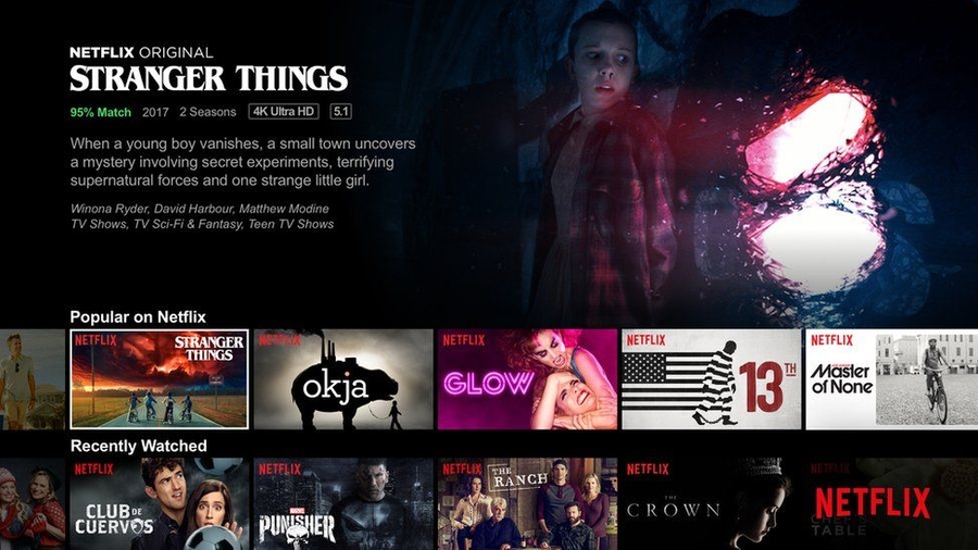
Building a Netflix Page Clone with Tailwind CSS

This challenge introduces you to the power of Tailwind CSS for building user interfaces by guiding you through the creation of a Netflix-inspired movie page.

Prerequisite:

  • Basic understanding of HTML and CSS.

  • Familiarity with Tailwind CSS (basic usage and utility classes).

  • Experience with a code editor (e.g., VS Code) for writing and managing code.

Problem Description:

Imagine you are a front-end developer working for a new streaming service that aims to provide an immersive user experience similar to Netflix. Your task is to create a visually appealing and responsive movie page that showcases the platform's offerings. This project will not only enhance your UI development skills but also demonstrate your ability to build professional-grade interfaces using modern CSS frameworks like Tailwind CSS. Completing this challenge will make you an attractive candidate for roles that require proficiency in front-end development and responsive design.

Instructions:

Utilize HTML and Tailwind CSS to create a visually appealing and responsive webpage that mimics the layout and style of a Netflix movie page.

Steps:

  1. Project Setup:

    • Create a new HTML file and link the Tailwind CSS CDN in the <head> section.

    • Consider using a code editor with Tailwind IntelliSense for code completion and styling suggestions.

  2. Basic Structure:

    • Use HTML to structure your page:

      • Create a header section for the Netflix logo and navigation elements (e.g., Home, Search, My List).

      • Design a hero section featuring a large banner image or video showcasing a popular movie/series.

      • Implement a content area displaying rows of movies/series with title, poster image, and brief descriptions.

      • Include a footer section with additional information or links.

  3. Styling with Tailwind CSS:

    • Leverage Tailwind's utility classes to style your webpage:

      • Apply layout classes (e.g., flex, justify-center, items-center) to position elements within sections.

      • Utilize typography classes (e.g., text-xl, font-bold) to style text elements (headings, titles, descriptions).

      • Implement grid classes (e.g., grid, grid-cols-3) to create a grid layout for displaying movie/series rows.

      • Apply image and background classes (e.g., rounded-lg, shadow-md) to style poster images and backgrounds.

  4. Responsiveness:

    • Ensure your page adapts to different screen sizes using Tailwind's responsive utilities:

      • Use responsive variants (e.g., md:text-2xl, lg:grid-cols-4) to adjust styles for various screen sizes (mobile, tablet, desktop).

Bonus Challenge:

  • Enhance your Netflix clone with additional functionalities:

    • Implement a basic search bar to filter displayed shows/movies based on user input.

    • Integrate hover effects for elements like movie posters (e.g., opacity change, subtle animations).

    • Design a modal component that displays movie/series details upon clicking a poster (using HTML and CSS).

    • Explore Tailwind's color palette and spacing utilities for further customization.

Learning Outcomes:

  • Gain practical experience with Tailwind CSS for rapid UI development.

  • Understand how to use Tailwind's utility classes for styling different HTML elements.

  • Develop skills in building responsive layouts that adapt to various screen sizes.

  • Learn the fundamentals of creating a visually appealing user interface with CSS.

By completing this challenge, you'll build a professional-looking Netflix clone that showcases your ability to create responsive and visually appealing web pages using Tailwind CSS.

Submission Guidelines:

  1. Code:

    • Submit a well-structured HTML file with embedded Tailwind CSS classes.

    • Ensure your code is well-commented, making it easy to understand your styling choices and structure.

  2. Assets:

    • Include any images or assets used in the project (e.g., movie posters, banner images).

    • Organize assets in a folder structure that makes it easy to locate and reference them in your HTML file.

  3. Live Demo (Optional):

    • If possible, deploy your project on a platform like GitHub Pages, Netlify, or Vercel.

    • Provide a link to the live demo of your Netflix clone.

Learning Resources

Week 6

Week 7

Week 8

Week 9

Week 10

Week 11

Week 12

Last updated